The showcase is the object that contains the
animated wagons, the camera system and the
electronics. Throughout the entire project, the
design ideas and iteration of the showcase had
changed many times.
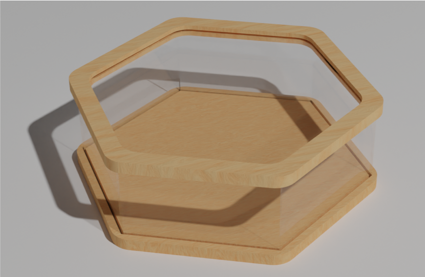 Showcase design v1.0 (presented in Zagreb)
This was the first design to be proposed, in the
third meeting in Croatia. It featured a wooden
hexagonal base, where the wagon had the space to
be placed; the base also had a groove around the
perimeter to fit plexiglass sheet used as walls
to support a “suspanded” wooden frame
A second design was also proposed in Zagreb. It
was a completely different approach, and way of
thinking.
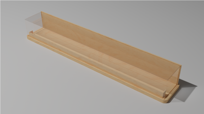 Showcase design v2.0 (presented in Zagreb)
In this design, our wagons had a linear
arrangement, instead of the circular one used in
the hexagonal showcase. With a voting, the
design chosen to be used was the hexagonal one,
thus the homework was to develop it and by the
meeting in Ireland, to produce a prototype.
Many iterations were made from the original
concept to the design used for the prototype,
chief among which was the splitting of the base
and top frame part into manageable and easily
machinable parts. As you can see from the
picture below, colons were also added to fulfill
the need of more rigidity when multiple
showcases had to be stacked one on top of
another.
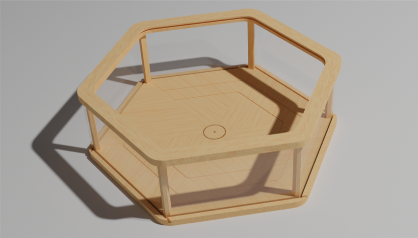 Showcase design v1.5 (presented in Dublin)
In Dublin things changed a lot. We were now told
that every partner school had to show ten
animated wagons, and it’s easy to understand
that a 6 wagons capacity showcase wasn’t enough.
It was time for a complete redesign of our
showcase. The idea was simple: if we need to
show ten wagons, why not design a decagonal
showcase, and that’s what we did.
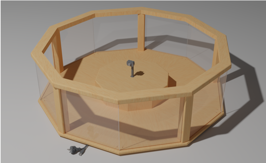 Showcase design v3.0 (presented in Kaunas)
This showcase can house 10 animated wagons, it
has an integrated camera system and it can
contain all the electronics in its raised center
part.
